

Mother Goose
Rebranding & brand identity for a mortgage broker in Kent

Overview
Mother Goose Mortgages is an established financial consultancy providing approachable, expert advice to homebuyers and property investors across Kent. To support the business's next phase of growth, a comprehensive rebrand was executed to evolve their existing visual identity into a modern, highly professional brand system.
The updated aesthetic retains the warmth and trustworthiness essential to personal financial services while introducing a sleek, confident design language across both print and digital applications.

The Creative Approach
Brand Analysis & Strategy: Conducting an initial brand audit to identify key messaging touchpoints, ensuring the evolved identity feels fresh and progressive without losing existing market recognition.
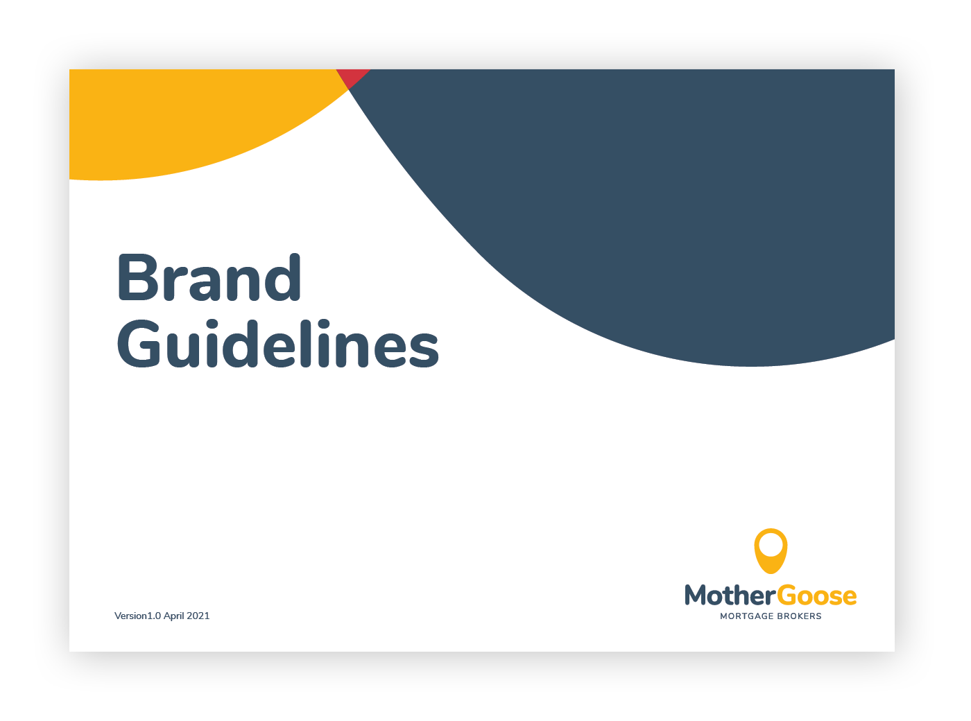
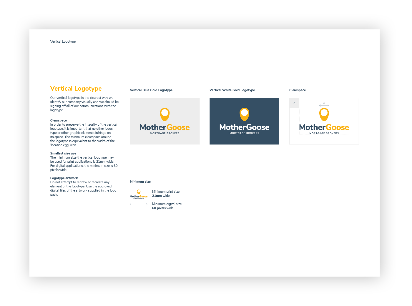
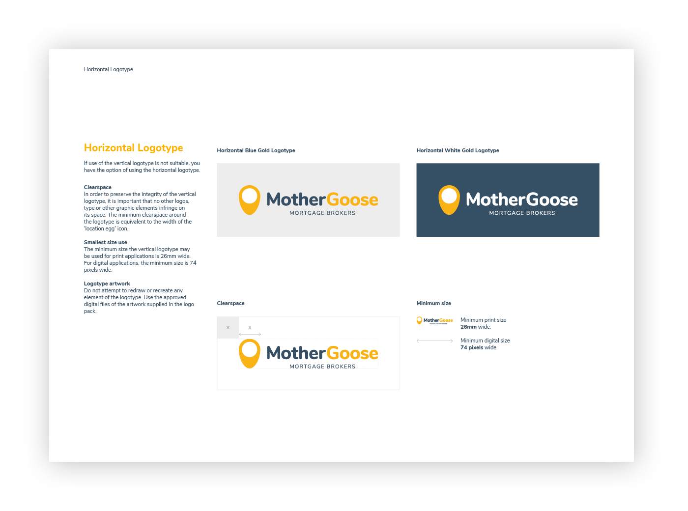
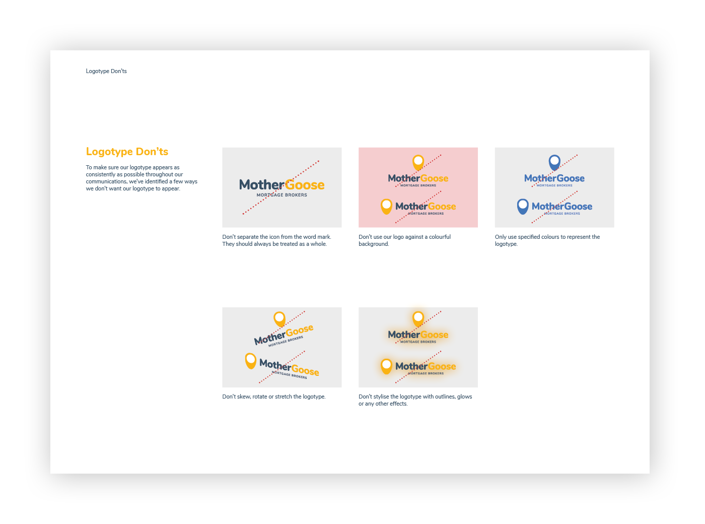
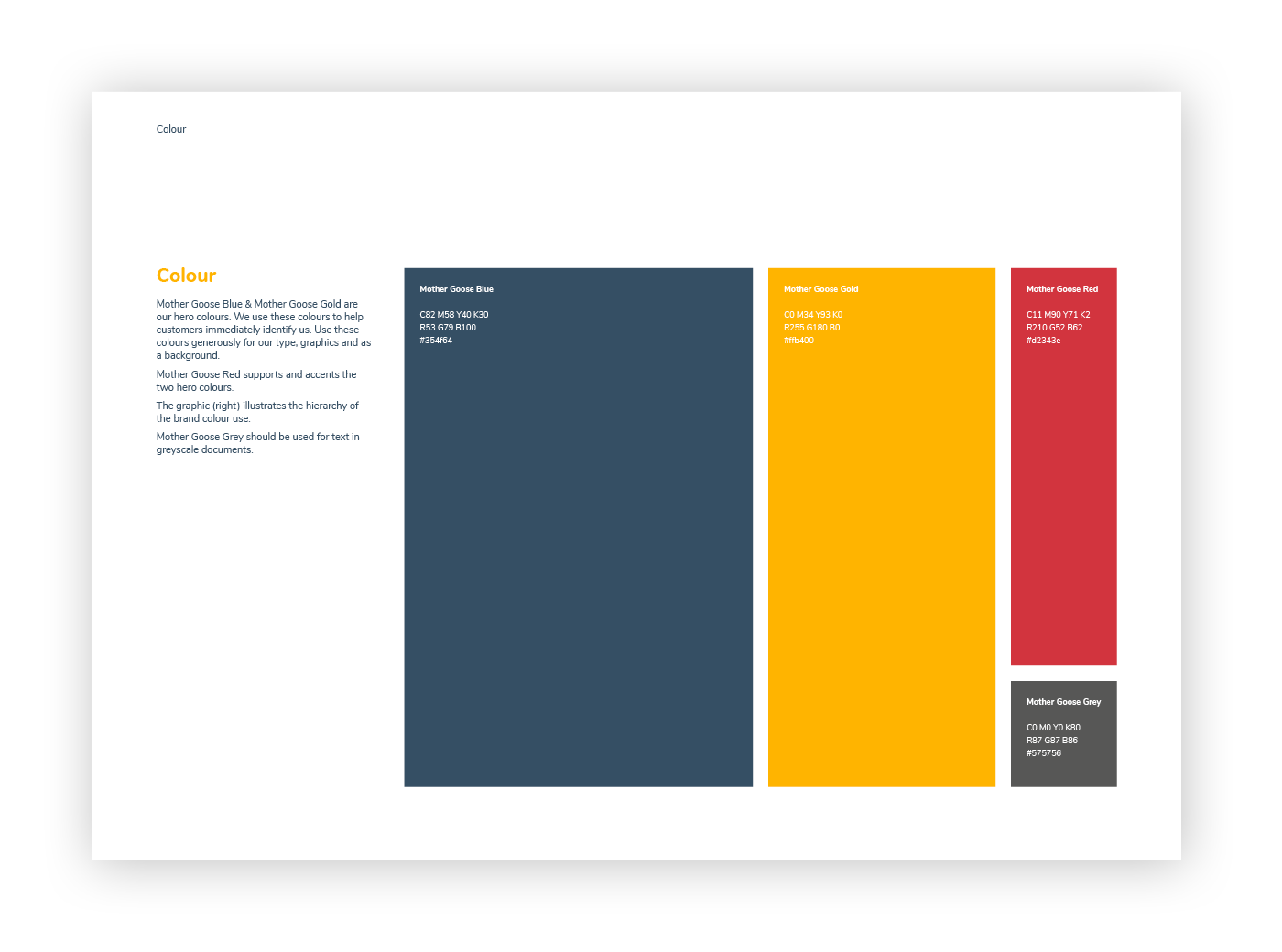
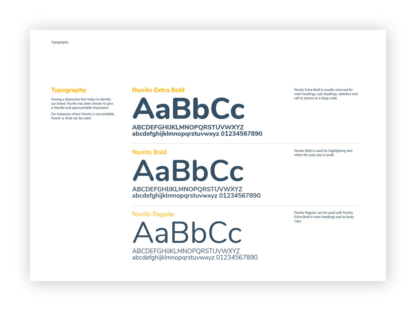
Identity System & Brand Guidelines: Designing a complete visual identity kit, including a refined logotype, primary and secondary colour palettes, typography rules, and comprehensive brand guidelines to ensure total visual consistency.
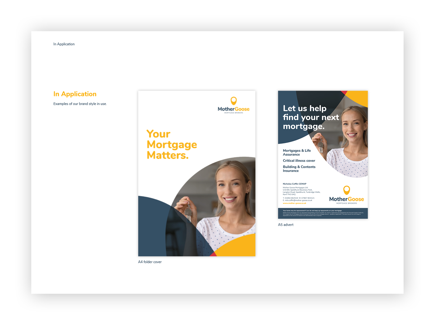
Corporate & Presentation Collateral: Developing high-quality print collateral, including client presentation folders, document covers, and promotional materials engineered to make a strong physical impression.
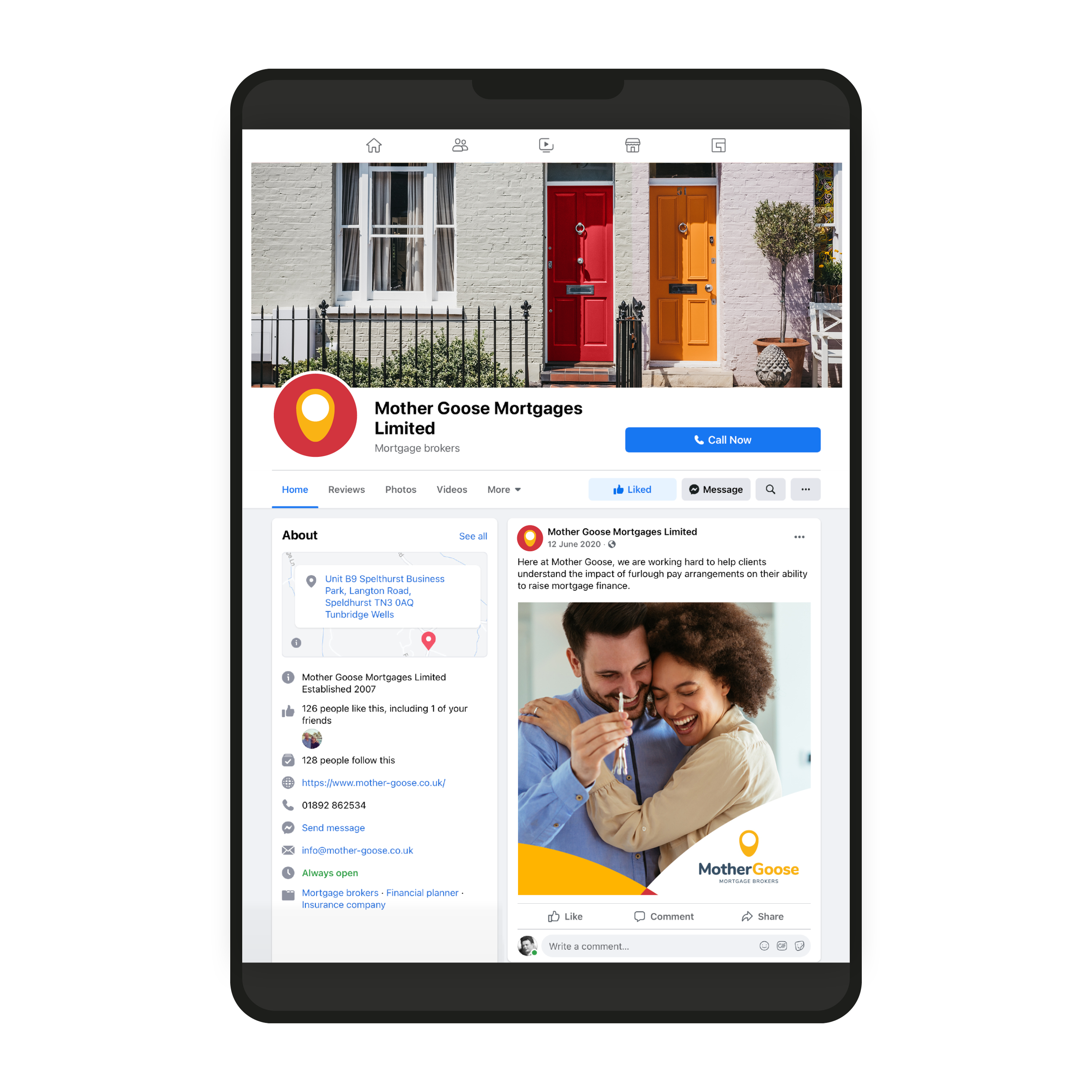
Digital & Social Media Assets: Creating a suite of branded social media templates and digital graphics tailored for ongoing marketing, lead generation, and client communications.
“Matt took our brief to move our brand on to the next stage and came back with excellent, imaginative and well thought through design alternatives. This has allowed our brand identity to evolve and extend its reach. Communication was clear and concise and Matt added value at every stage of the process. I would highly recommend Matt Ollive Design.”
BRAND ANALYSIS DESIGN CREATIVE DIRECTION PRODUCTION